How to Preview and Edit Mobile Version of WordPress Site
Do you want to see how your WordPress site looks on a mobile device? So you can examine how your site appears on mobile devices by previewing the mobile layout.
When you can check your live site on your phone, this isn’t useful during the development stage. Even if your site is live, viewing the mobile version on a desktop computer allows you to make changes fast and see how they affect your site.
So now, in this article, ArrowTheme will show you How to edit mobile version of WordPress site. Before coming to find out how to edit the mobile version of a WordPress site, we will learn why should preview the mobile layout.
Why should preview the mobile layout?
More than half of your site visitors will visit your site via their mobile phones. A tablet will be used by about 3% of the population. It means that having a mobile-friendly website is critical. Mobile is so significant that Google’s website ranking now uses a “mobile-first” index.
You should evaluate how your site appears on mobile even in case you’re using a responsive WordPress theme. You could design different versions of crucial landing pages that are tailored to the needs of mobile consumers (more on this later).
There are so many different mobile screen sizes and browsers. So it’s crucial to remember that most mobile previews will be imperfect. Looking at your site on a mobile device should always be your final check.
How to preview the mobile version of the WordPress site?
A responsive WordPress theme offers numerous benefits. However, you must still test how your site appears on smartphones in real-time. Because there are so many different screen sizes and browsers, none of the mobile previews can offer a flawless and fully accurate preview.
Besides that, you should always rely on the real-world experience of viewing your website on a smartphone or mobile device. This may motivate you to improve your important landing pages and produce different mobile-friendly versions.
So, let’s look at two different approaches to see if your WordPress site is mobile-friendly.
Using the Theme Customizer in WordPress
Using WP’s Theme Customizer is the first and simplest way to see the mobile version preview. Go to Appearance > Customize from your WordPress dashboard.
Therefore, you’ll see all of the choices in the left-hand menu when you open the WordPress Theme Customizer. Depending on the theme you’re using, there may be some differences in the options available.
At the bottom of the screen, you’ll notice a smartphone symbol. When you click it, you’ll receive a preview of how your site will appear on mobile devices.
Don’t worry if the blue editing icons perplex you. They only appear on the previewer, not on your actual site.
PRO Tips: If you haven’t yet launched your blog or in case it’s in maintenance mode, this technique of previewing is quite useful. Because it allows you to implement adjustments and see how they look before going live.
Device mode in Google Chrome’s Developer Tools
In case you don’t feel comfortable using the WP Theme Customizer for any reason, you may use the Google Chrome Browser to see if WordPress is mobile-friendly. It’s also a pretty quick and easy method with only a few stages.
Simply open your Google Chrome browser and navigate to the page you wish to test.
Then, with a right-click on the page, select Inspect (Ctrl + Shift + C).
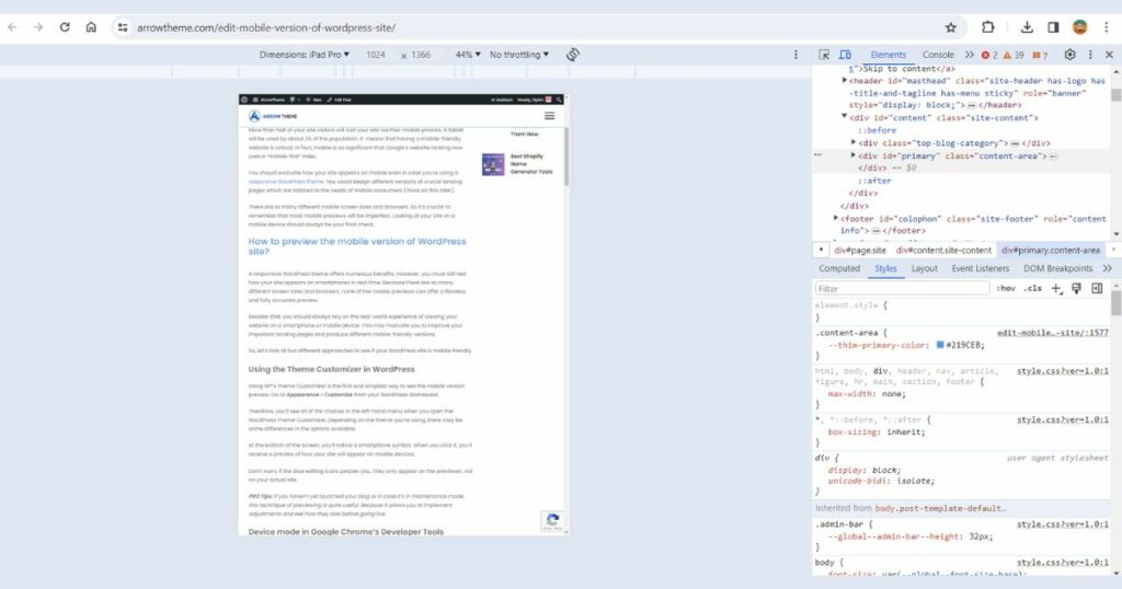
So you can see a preview of any webpage on any site. It also can be the website of one of your competitors.
A new pane will appear on your right-hand side. Moreover, it will look like this:
The developer’s feature enables you to see the HTML source code for your website. To display the mobile view, click the Toggle Device Toolbar button.
In the mobile preview, you’ll notice a few modifications: your website has been downsized to meet the small screen size. Besides that, additional changes may be made. So you should look for differences and make a note of what needs to be changed.
Furthermore, you also should check out what happens when you move your mouse over the mobile view.
PRO Tips: Hold down the Shift key while clicking and moving your mouse to observe how your mobile screen zooms in and out.
The benefit of using this strategy to preview your mobile website is that it allows you to check how the page appears on various smartphone models. These extra options appear on your site’s mobile view. So you can modify the device’s screen size no matter what kind of preview you viewed once you click on the Toggle Device Toolbar.
PRO Tips: to rotate the mobile screen, you can use the rotate icon in the upper right corner. You can also examine components on the page by clicking Inspect from the menu.
Why is Page Builder Important for RWD?
RWD is something you should consider carefully from the start of your website development. Coming to making your site highly attractive, navigable, and effective across multiple screen sizes, there are several factors to consider.
WordPress page builders play a crucial role in this process. Because they give you the foundations of your site’s design. As a result, you should educate yourself thoroughly before making your decision. So you can devote more time to developing your website.
WPBakery and Elementor, in our opinion, are fantastic solutions. Because they can meet a wide range of requirements.
If you’re on a tight budget, Elementor is the way to go. It’s a beginner-friendly, easy-to-use plugin with a generous free version and a strong collection of features.
It also works with other popular WordPress plugins and services such as MailChimp, WooCommerce, HubSpot, Yoast SEO, and others.
WPBakery Page Builder is a premium plugin that will never let you down if you can pay for it. It has a massive collection of elements, as well as a slew of blocks and options. It’s also simple to use and creative.
Although page builders are required for RWD, the theme you choose is also critical. Because it can provide some unique features. Furthermore, these authors create unique widgets and elements.
Besides that, it can be customized independently of page builders. In addition, other elements also allow you to tailor responsiveness to your requirements. As a result, you should select a theme created by well-known, reputable authors.
In case you want to use a free WordPress theme, this is extremely vital. ArrowTheme tried a lot of free themes to save you time and stress. So, if you’re looking for a free responsive, feature-rich, and dependable theme, we recommend EduPress.
Now we will move to find out the answer to the question: How to edit the mobile version of the WordPress site?
How to Edit The Mobile Version of The WordPress Site in Elementor?
When it comes to modifying the mobile version of your website, Elementor is the greatest page builder. It’s possible that you didn’t notice this small icon in the settings is the Viewport Icon:
This icon shows that any value with it next to it can be updated separately for the desktop and mobile versions of the site. For example, with the Column Width settings, you can change the value of desktop, mobile, and tablet.
The value you specify for each device is only relevant to that device. The HTML tag does not have an indicator next to it. It means the same value on all devices.
In case you want to adjust the value for the mobile device. So you need to select the mobile layout option and enter the correct values. You can see a live preview of all the changes on the right side of the screen. As a result, you can see how the new numbers will appear on the device right away.
Besides that, you must select the desktop layout option to return to the desktop view. You can do so by following the steps above or by selecting this small icon from the page’s bottom menu:
Another key aspect of responsiveness is that you can turn off the columns and rows for certain devices.
In case you want to adjust the value for the mobile device. So you need to select the mobile layout option and enter the correct values. You can see a live preview of all the changes on the right side of the screen. As a result, you can see how the new numbers will appear on the device right away.
Besides that, you must select the desktop layout option to return to the desktop view. You can do so by following the steps above or by selecting this small icon from the page’s bottom menu:
Another key aspect of responsiveness is that you can turn off the columns and rows for certain devices,
Follow these steps to get to this option:
- Right-click on the row/column you want to edit.
- Select the Edit Section option.
- Select the Advanced tab.
- Click Responsive from the dropdown menu.
This option is critical in case we have a section that we know should only be displayed on the desktop. Therefore, it will be disabled on other devices. And, to make up for it, we may create a single part to show on all devices except the desktop.
We may also see the Reverse column choice (Tablet/Mobile) when it comes to columns. It’s better to use an example to demonstrate this. Let’s pretend we have a desktop area like this, with content divided into two columns and photographs followed by a brief text:
The content on mobile devices will be rearranged as shown in the figure below, in the same sequence as on the desktop:
How to Edit The Mobile Version of The WordPress Site with Plugins?
Responsive Menu
The menu is the key to a good user experience. When someone visits your website, it’s the first thing they click on. Therefore, it has an impact on how quickly visitors find what they’re looking for, and how long they remain. It’s critical to have a well-designed, well-structured menu.
Because it allows for easy navigation. However, it’s not as straightforward as it appears. You may have a fantastic menu that works flawlessly on a desktop. But it is too large for a mobile device. In this instance, one option is to change your desktop version to a mobile screen size.
But what if doing so results in the loss of too much useful data? In that situation, you can develop a separate menu that is solely for mobile screens.
This is something that many WP themes allow you to do. In case your theme isn’t one of those. So don’t worry. Because there are lots of responsive menu plugins available.
So, the Responsive Menu plugin can help you. Because it provides 150+ customization options. Moreover, it requires no technical experience. As a result, you may use it to add animations, and background images, and change the position of menu buttons. It’s really simple to use, making it ideal for complete beginners.
Photographs and Galleries
An image may be expressed in hundreds of different ways. So make sure your image looks great on any screen size. Therefore, beautiful images are necessary no matter what niche you’re in. However, no matter how beautiful your photographs are, in case they take too long to load or aren’t displayed well.
So you can lose a significant portion of your audience. To ensure that this does not happen, we offer the Envira Gallery Lite plugin. It will assist you in creating powerful galleries. Because It has several benefits such as optimized for web and server performance. This is wonderful news for your SEO.
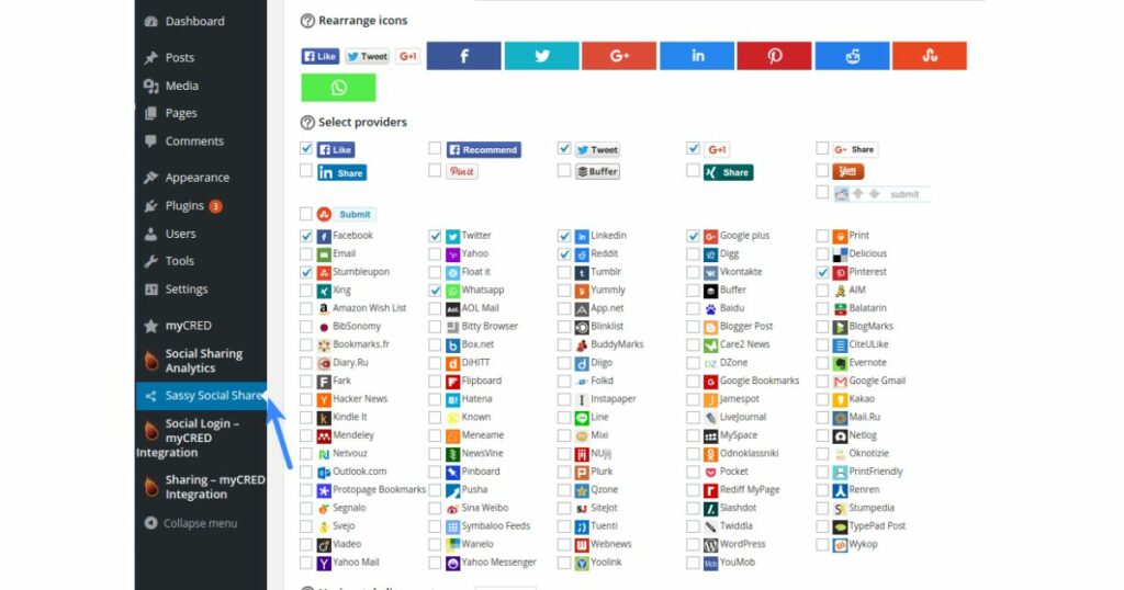
Buttons for social sharing
After you’ve created a fantastic, responsive menu and attractive galleries, the following step is to add social sharing buttons. Their dimensions should be adjusted to fit the gadget. A large button on a little screen causes the visitor to click in an occidental manner. It is highly annoying.
However, small buttons on a large screen are difficult to distinguish. Sassy Social Share is a plugin that can let you create unique buttons. It’s simple to use, completely free, and beginner-friendly. This will make sharing a breeze for both you and your guests.
Mobile friendly websites
There’s no better way than a plugin like WPtouch when you make your site mobile-compatible rapidly. This plugin is designed to apply a basic and stylish mobile theme to your WordPress site automatically.
So, even if your website doesn’t have a mobile version, this plugin also enables a mobile-friendly version of your site. Therefore, this makes sure that you don’t lose your rank. It also lets you change the look of the site in a variety of ways.
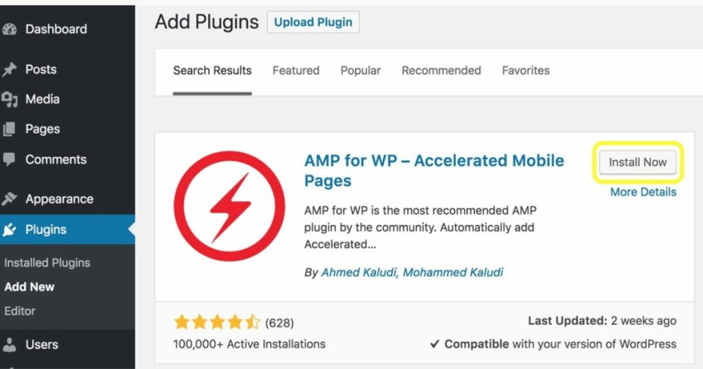
User experience is also influenced by page loading speed. It is especially significant on mobile devices. In case you’re having trouble with this. So you can use the Accelerated Mobile Pages plugin. This is one of the quickest and easiest solutions to boost the speed of your site.
On mobile devices, don’t use popups
Popups are rarely funny. Moreover, they are annoying on mobile devices. Because they take up a large portion of the screen and force a visitor to dismiss them before proceeding to the page’s content. As a result, in the mobile version of your site, it’s better to skip them.
How you avoid them is mostly determined by your service provider. However the large of them offer the option to turn off unwanted popups on mobile devices. Also, keep in mind that Google penalizes websites with a lot of popups.
Conclusion on Edit Mobile Version of WordPress Site
So that is all about How to edit the mobile version of the WordPress site. Number of people using smartphones to access the internet is growing. So it’s reasonable to expect a greater number of solutions and possibilities for mobile versions of websites.
Although designers are working hard to handle the wide range of usage patterns, you should choose a mobile-friendly WordPress theme and a page builder with all of the features you require.
Read More: Dive into the World’s Best Open Source eCommerce Platforms
Contact US – ArrowTheme:
– Email: [email protected]
– Facebook: Facebook.com/ArrowThemeTeam
– Website: ArrowTheme.com