How To Customize Checkout Page In Shopify
Having complete control over all elements of your store’s appearance is essential and desired as an eCommerce seller. The Shopify Checkout page is a great example of this. It is the most important component in determining your income. Because it ensures that clients who arrive at this page will finish their purchase and not abandon it.
Therefore, this might be the solution for you if you’re having issues with drop-off customers or many consumers leaving carts. Even if you are a newbie, we will share to you How to customize checkout page in Shopify to increase trust and conversion rate.
But before coming to find the answer for the question how to customize checkout page in shopify, we will go through the definition of Shopify checkout page.
So let’s go.
What Is The Shopify Checkout Page?

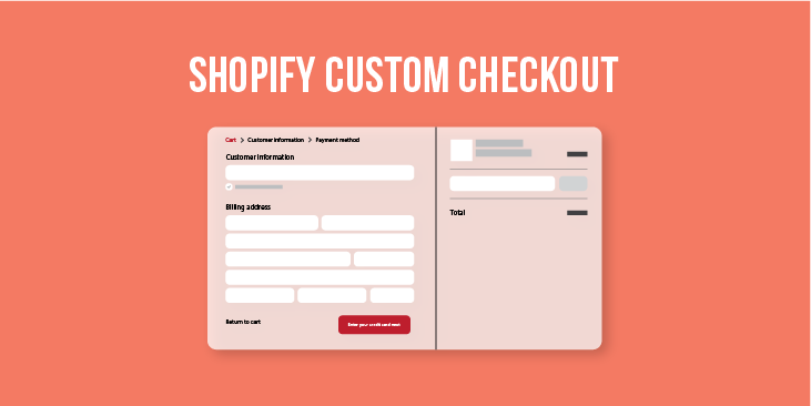
The Shopify Checkout Page is where orders and payments are accepted. Customers can see a popup-style cart after adding items to their cart and click the “checkout” button. Therefore, it allows them to enter their shipping information and payment details before making their transaction.
With Shop Pay, which enables for a 60% faster conversion rate, the Shopify Checkout Page greatly sped conversion. It also has a sales subscription as well as excellent mobile optimization. According to Mobile eCommerce Stats, 70% of customers buy on their phones. As a result, even if the number of customers is excessive, the Checkout Page will never be down.
Shopify Checkout Page, like other Checkout Pages, allows customers to make purchases using local payment options such as multi-currency and digital wallets.
Elements Of A Shopify Checkout Page
The Shopify checkout page has many of the features that make for a high-converting user interface. Here are the most important elements to consider when coming to boosting conversion rates.
Call To Action
The call to action is the most visually stunning element on the Shopify checkout page. Moreover, it helps to guarantee that the user moves forward in the process.
Reasonably Organized Layout
In addition to the call to action, the layout with logically organized position and visual attributes is also extremely ideal. For example, the “Continue to shipping” button was designed by Shopify’s designers to fit within the information hierarchy of the checkout page layout.
The Workflow Helps Orient The User
The checkout procedure usually needs a lot of input from the user (shipping, payment, etc. ). Moreover, any annoyance may cause them to abandon it. Therefore, to reduce “friction” in the checkout process, Shopify has removed any unnecessary features.
How To Edit Shopify Checkout Page?

The checkout page layout shown here is the most basic. Although you can’t modify the page’s set structure, Shopify gives merchants some control over the page’s interface.
Manually Edit Shopify Checkout Page
1. In the Dashboard, select Setting > Checkout
Click Setting > Checkout to edit Checkout page
2. In the Style section, select Customize checkout
3. In the Theme setting, you may change the Banner picture, Color, and Main Content Area… You must be a Shopify plus client to update additional features to modify.
Using Code In Shopify Plus
1. Go to the Online store > Theme in the admin panel.
2. Select Edit code from the Action.
3. Choose checkout.liquid file to edit your change
4. Click Preview to see the update in action, then Save if you’re satisfied.
How To Make A Shopify Customized Checkout Page To Upsell?
As a vendor, you must understand the aspects that impact the consumers’ purchasing decisions. There are numerous factors to consider, like the trend, price, promotion, and so on. However, in this post, I’ll discuss several key elements to customize checkout page in shopify.
Here are the essential factors to consider while deciding whether or not to make a purchase:
- Trust
- Information
- Motivation
- Visualization
Gain Client Trust
TRUST is the most significant barrier to customers buying your products. People sell and purchase depending on the trust they have in their partners. There is a point to increasing credibility by optimizing the checkout page on Shopify:
1. Add More Information About Your Store
It’s an absolute essential for your Shopify store. You could easily add your logo to the Checkout page, but it instantly improves the authenticity and trustworthiness of your site. If you’re new to Shopify and are just getting started, don’t forget to create a logo for your store and change it on your checkout page.
You may add your company’s logo by following these steps:
Go to Dashboard > Setting > Checkout > Customize > Theme Setting > Logo in the admin (position: Left, right or middle and size: Small, medium or big)
After you’ve finished updating the Shopify checkout page, go to Logo to make changes to your shop’s logo.
2. Provide More Methods Of Payments
When customers realize that the business owner can accept a variety of payment options, they feel more secure. Furthermore, the payment method is an undeniable part of the purchasing choice. Because you provide more payment options, clients can use their preferred card to pay their payments.
You can do so by following the steps below:
Click Payment in the Shopify admin. Add the payment methods to the Payment provider.
Allowing clients to see the many types of credit cards and other payment options available can help them feel more secure.
However, on the initial checkout page, the Shopify checkout page did not mention what payments are accepted. Besides that, a client can’t see a MasterCard or Visa logo anywhere.
However, you may add payment security to your Shopify store’s checkout using tools like Modemagic or the TrustedSite app.
Furthermore, you may also use the Checkout customization tab in your Shopify dashboard settings to add a picture to the badges.
3. Add Trust Badge
There is still a lot of free space on the right-hand side under the order summary. Therefore, you can certainly add trust badges to this area.
With those badges, you can boost your store’s trustworthiness with clients. Besides that, you also inform them about your store’s unique features (such as a satisfaction guarantee and the ability to track your order progress) that will assist them in completing their purchase. You may simply get trust badges on Shopify App Store or ShopClimb’s Free
Information
Another important component is the shop information displayed on the checkout page. Your page’s information may be displayed as photos or text. All of this information, however, should be reasonable and consistent with the rest of your shop.
Here are some suggestions for improving your store’s information on the checkout page.
1. The Information Consistency System
As you may know, a logo is just a visual element that identifies a company. The store’s color is significant. Each brand selects a few colors to represent its brand attributes. The brand guideline includes both the logo and the brand color. The checkout page’s brand logo and color should be fixed and constant throughout all pages.
Your shop appears entirely professional and trustworthy due to the great consistency between the company logo and the color on the checkout page!
2. Customize Checkout Page In Shopify With Logical Layout
The Checkout page already has a simple and well-organized structure, according to Shopify’s development team. All elements and positions are grouped according to the progress of the payment.
However, you may change the order of some items or even add more parts to the Checkout page. Therefore, it may result in a new page layout. If you want to update your checkout page, you should think about the structure of the page.
Visualization
Visualization has a significant influence on customer awareness of the shop. Sellers must perform wonderfully on their checkout page in order to acquire a high conversion rate.
Create a “Why Choose Us” section for a well-balanced presentation.
To balance the two components and ensure effective visualization, I propose creating a “Why Choose Us” section on the right-hand side of the checkout page.
You can say whatever you like in the “Why chose us”. Presenting some significant points regarding products, such as wonderful policies for delivering products; a promotion for the next purchase; and tracking the order progress, will capture buyers’ attention.
You may use javascript and checkout.liquid to add this part to your page. This method allows you to insert any section of the page, but it is only available to Shopify plus members.
Use the code below to find the part where you need to put “Why select us.” I’ll put it underneath the Order Summary section in this case. Then you add “CTA”
(function($) {
// if customer is in the contact information section of checkout process
if (Shopify.Checkout.step === 'contact_information') {
$(document).on('page:load page:change', function() {
$('.order-summary__sections').append(cta);
})
}
});
After that, paste this code into your program. After you’ve finished changing the program, look below the Summary order for the “Why choose us”.
var cta = `
<section class="wcu">
<span class="wcu-title">Why choose us?</span>
<div class="icon">
</div>
</section>
`;
Using assistant features such as Why choose us; Social proof popup; Product detail counter;… on Fera.ai is another option to create the “Why choose us” part.
Emotion
A checkout timer may assist generate a sense of urgency among your visitors. Because it encouragé them to complete their purchase immediately. You can add a nice checkout timing to your checkout page using a countdown timer tool like fera.ai.
You may customize the text of the countdown timer in the app to meet your store’s demands. Besides that, you also can set up a customized urgent message for when the timer expires. This is a wonderful approach to encourage customers to convert right away.
Take Your Business To The Next Level With Arrowtheme
The checkout page is a critical component of your business. The greatest strategy to increase your sales is to follow the above recommendations and notes. But sellers must use it carefully and adjust it to the business as well as the conditions.
So that is all the guideline for you to customize checkout page in shopify. However, if you need the assistance, the developers of ArrowTheme are ready to help you.
Contact US – ArrowTheme:
– Email: [email protected]
– Facebook: Facebook.com/ArrowThemeTeam
– Website: ArrowTheme.com


