10+ Best Ecommerce Website Design Examples (+ Tips)
Creating a great first impression is crucial for any online store. Research shows that customers decide whether to stay on a website within a split second. In other words, your eCommerce website design is vital for the success of your business.
This article is perfect for those who are creating their first online store or looking to improve their existing one. We’ll show you examples of successful eCommerce websites, offer advice on selecting the right platform, and share tips for making your online business look its best.
Lusion – Multipurpose eCommerce Shopify Theme
We provide an amazing Shopify theme with fast and responsive designs. Let’s find out!
Essential Elements of Effective eCommerce Website Design
The most successful eCommerce websites prioritize user experience throughout the entire customer journey. Here are four key components to consider when designing your eCommerce site:
- Building Customer Trust: New visitors need to trust your brand before making a purchase. Incorporate trust indicators like clear contact information, a transparent return policy, technical certifications (e.g., secure payment badges), and customer reviews or testimonials.
- Creating Visual Appeal: First impressions matter. Invest in high-quality product photography and lifestyle images. Use color, fonts, and visual hierarchy strategically to guide the customer journey and evoke emotions.
- Prioritizing Responsive Design: Ensure your site is mobile-friendly and functions seamlessly across all devices. Personally test the transactional flow on different screens to guarantee a smooth experience for customers.
- Designing Clear Navigation: Help customers find products easily with intuitive navigation. Use clear, concise labels for top-level menu headers like “Shop,” “About Us,” “Bestsellers,” and “Contact Us.” Place additional links (e.g., Return Policy, Terms of Service) in the footer.
10+ eCommerce website design examples
Allbirds
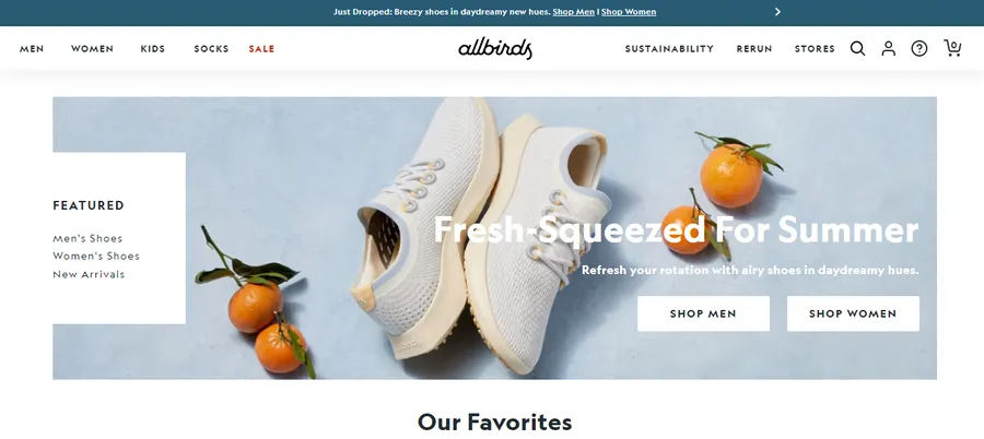
Allbirds focuses on sustainable footwear and apparel made from natural materials like merino wool and eucalyptus tree fiber. Their website design reflects this eco-conscious brand identity.
Key Features:
- Clean and Minimalist Aesthetic: The site uses lots of white space and simple typography, allowing the products and their natural materials to shine.
- Storytelling and Impact: Allbirds emphasizes the sustainability story behind each product, showing the materials and processes used.
- Product Focused: The product pages are detailed, with high-quality images, clear descriptions, and customer reviews.
- Easy Navigation: The website is easy to browse, with clear categories and filters.
Thesus Outdoors
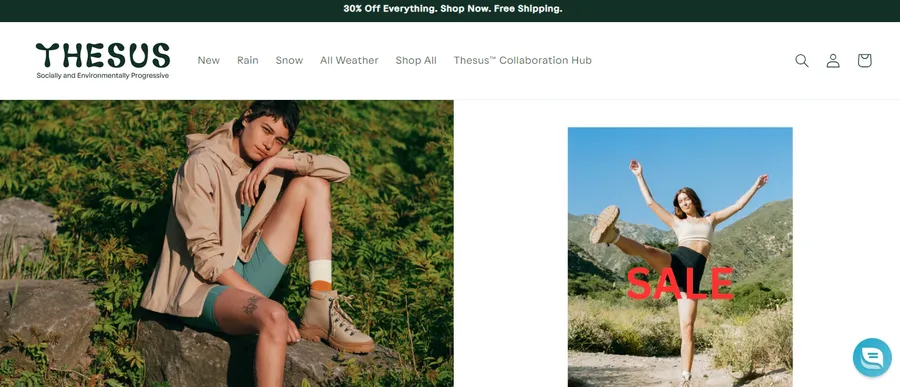
Thesus creates rugged and durable outdoor gear, including backpacks, duffel bags, and accessories. Their website reflects their adventurous spirit and the quality of their products.
Key Features:
- Bold Imagery: The website uses large, striking photos of people using Thesus gear in various outdoor settings. This creates a sense of adventure and aspiration.
- Focus on Materials and Construction: Thesus highlights the technical aspects of their gear, explaining the materials, construction, and durability.
- Community and Lifestyle: The website features stories, blog posts, and user-generated content that showcase the Thesus community and lifestyle.
Pure Cycles
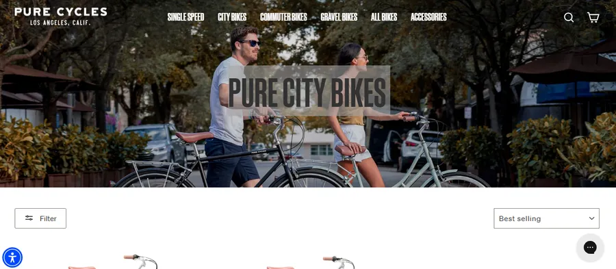
Pure Cycles sells affordable, stylish bicycles for urban commuting and casual riding. Their website is designed to be simple, informative, and customer-friendly.
Key Features:
- Clear Product Showcase: The bicycles are presented with high-quality images and essential details (like frame material, gears, etc.).
- Customization Options: Some models allow customization (color, accessories) to help customers create their ideal bike.
- Bike Sizing Guide: A comprehensive guide helps customers choose the right size bike for their height and riding style.
- Helpful Blog and FAQ: Pure Cycles provides resources to educate customers on bike care and maintenance.
MVMT
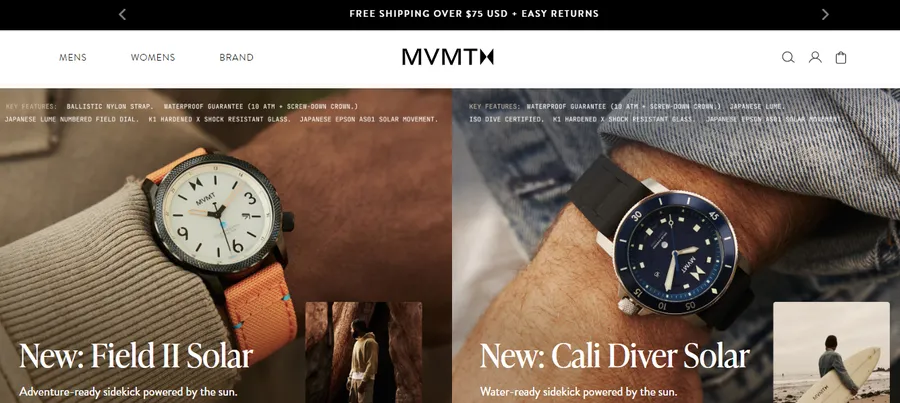
MVMT is known for minimalist watches, sunglasses, and jewelry. Their website reflects this modern, understated aesthetic.
Key Features:
- Sleek Design: The site uses a black, white, and gray color palette with bold typography, creating a high-end feel.
- Product-Focused Imagery: Large, detailed product photos dominate the pages, highlighting the products’ design and quality.
- Lifestyle Integration: MVMT features lifestyle images of people wearing their products, creating aspirational appeal.
- Mobile-First Design: The site is optimized for mobile viewing, ensuring a seamless experience on smaller screens.
Finn
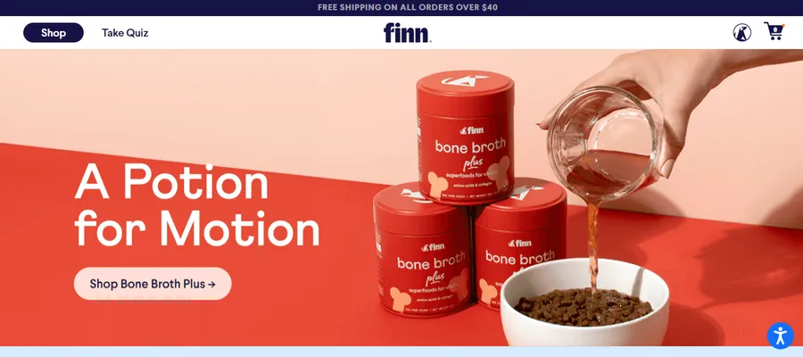
Finn is a pet food subscription service. Their website is friendly, and informative, and focuses on the health benefits of their product.
Key Features:
- Clean and Welcoming: The site uses a light color palette, playful illustrations, and cute pet photos to create a cheerful atmosphere.
- Educational Content: Finn emphasizes the nutritional value of their food with detailed ingredient lists, feeding guides, and blog articles on pet health.
- Customization and Convenience: The subscription process is streamlined, allowing customers to tailor food plans to their pet’s needs and delivery frequency.
- Customer Testimonials: Finn prominently features customer reviews and success stories, building trust and credibility.
Topo Designs
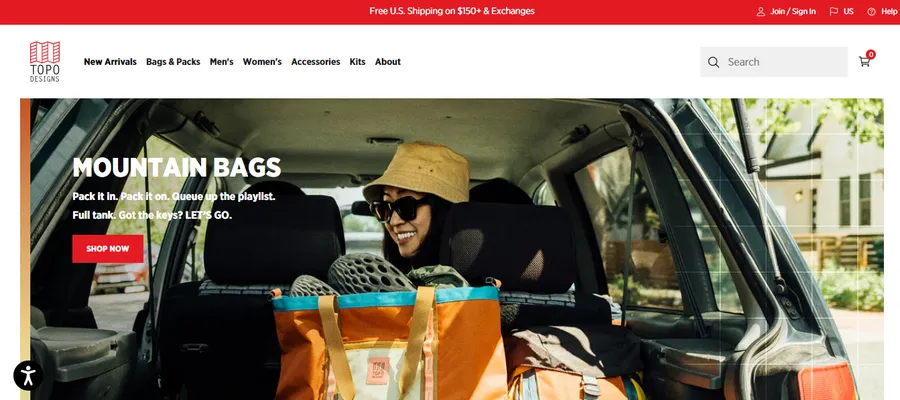
Topo Designs specializes in outdoor gear and bags with a retro-inspired aesthetic. Their website reflects this outdoorsy, vintage vibe.
Key Features:
- Earthy Color Palette: The site uses warm earth tones (brown, green, orange) and rustic textures that evoke a sense of adventure and exploration.
- Focus on Functionality: Topo Designs highlights the practical features of their gear, such as durability, weather resistance, and organization.
- Community-Driven: The website features user-generated photos, blog posts about outdoor adventures, and collaborations with other outdoor brands, fostering a sense of community.
- Product Customization: Some bags offer customization options, allowing customers to personalize their gear with different colors and accessories.
Beardbrand
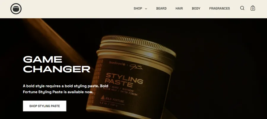
Beardbrand is not just about beard care products, it’s a lifestyle brand for the modern beardsman. Their website reflects this, blending a masculine aesthetic with a focus on community and education.
Key Features:
- Strong Visual Branding: The website features bold typography, warm earth tones, and rugged imagery, creating a distinct brand identity.
- Content-Rich: The site includes a blog, video tutorials, and a comprehensive guide to beard care, positioning Beardbrand as an authority in the field.
- Community Focus: The “Urban Beardsman” blog and social media integration fosters a sense of belonging and connection among customers.
Kylie Cosmetics
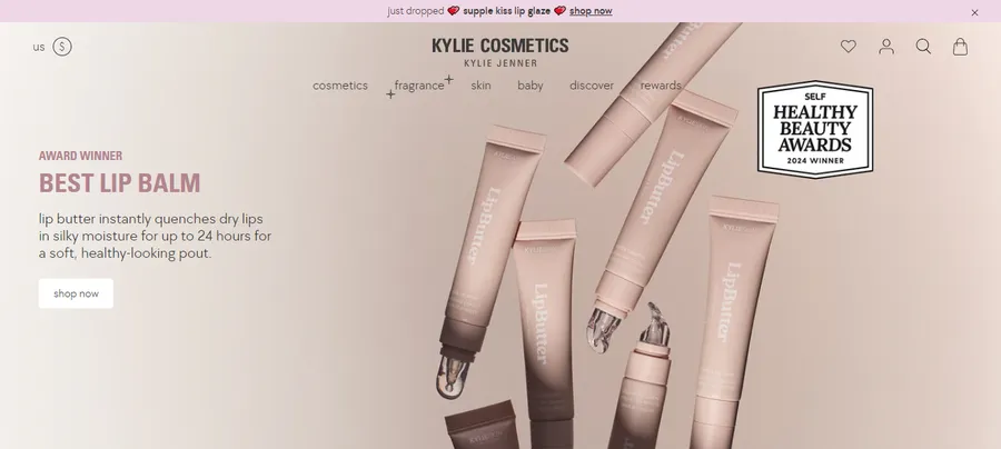
Kylie Cosmetics, the brainchild of Kylie Jenner, is a cosmetics brand known for its bold colors and high-quality products. The website design mirrors this aesthetic and the brand’s youthful energy.
Key Features:
- Glamorous Visuals: The site features high-resolution images of models, product close-ups, and sleek animations, creating a luxurious feel.
- Product-Centric: The layout prioritizes product showcases, with clear calls to action and easy access to product information.
- Limited Edition Drops: The website generates excitement and urgency through limited edition product launches and exclusive collaborations.
Death Wish Coffee
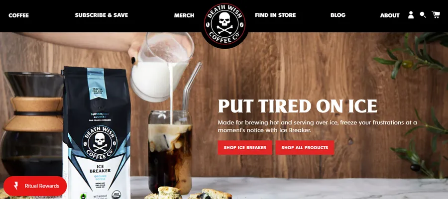
Death Wish Coffee sells the “World’s Strongest Coffee,” and their website embodies this edgy, caffeinated spirit.
Key Features:
- Bold and Dark Aesthetic: The site uses a dark color scheme, strong typography, and edgy illustrations that align with the brand’s intense image.
- Storytelling and Branding: Death Wish Coffee emphasizes its brand story and the unique character of its coffee through engaging copy and visuals.
- Subscription Focus: The website promotes its coffee subscription service, making it easy for customers to get their caffeine fix delivered regularly.
Essential Tips for Effective eCommerce Website Design
An effective eCommerce website is crucial for your online business’s success. It acts as your digital storefront, welcoming customers and showcasing your brand. Whether you’re starting a new venture or refreshing an existing one, these key tips can help you create an eCommerce website that drives sales and fosters customer loyalty:
- Prioritize Simplicity: A clean and uncluttered design makes navigation easy and puts the focus on your products. Avoid excessive ads or pop-ups that distract from the shopping experience.
- Showcase Your Brand: Infuse your website with your brand’s unique personality. Use consistent visuals, messaging, and a clear value proposition to differentiate yourself from competitors.
- Choose the Right Platform: Select an eCommerce platform like Shopify that offers user-friendly tools, customizable templates, and robust features to support your business growth.
- Prioritize User Experience: Put yourself in your customers’ shoes. Ensure intuitive navigation, clear product descriptions, and a seamless checkout process.
- Invest in High-Quality Images: Professional product photos and visuals enhance your site’s appeal and build trust with potential buyers.
- Project Professionalism: A polished website design conveys credibility and reassures customers that their information is secure.
- Harness Social Proof: Incorporate customer reviews, testimonials, or user-generated content to build trust and encourage purchases.
- Streamline Checkout: Offer multiple payment options and make the checkout process quick and hassle-free to reduce cart abandonment.
- Optimize for Mobile: Ensure your website is responsive and adapts seamlessly to different screen sizes, as many customers shop on their mobile devices.
- Track and Analyze: Utilize analytics tools to track website performance, identify areas for improvement, and make data-driven decisions to optimize your eCommerce strategy.
Final Thoughts: eCommerce Website Design
Effective eCommerce website design prioritizes user experience. It’s mobile-friendly, easy to navigate, and ensures a secure checkout process. These factors help create a positive and memorable online shopping experience, fostering trust and ultimately driving sales. Remember, first impressions matter, and in the fast-paced world of eCommerce, they’re formed in the blink of an eye.
Read More: 10+ Best Online Shopping Websites

